Liens hypertexte
60.1 Lien hypertexte avec buildAnnotatedString()
Dans une application Android avec Jetpack Compose, il est possible de créer un lien hypertexte qui permettra d'ouvrir l'URL dans un navigateur.
Text(
    buildAnnotatedString {
        withLink(
            LinkAnnotation.Url(
                "https://apical.xyz",
            )
        ) {
            append("Apical")
        }
    }
)
Et pour styler le texte du lien :
Text(
    buildAnnotatedString {
        withLink(
            LinkAnnotation.Url(
                "https://apical.xyz",
                styles = TextLinkStyles(
                    style = SpanStyle(
                        fontSize = 25.sp,
                    )
                ),
            )
        ) {
            append("Apical")
        }
    }
)
Notez qu'auparavant, on utilisait un texte enrichi avec un addStringAnnotation et le composable ClickableText. Ce composable est obsolète depuis la sortie de Compose Foundation 1.7.0 en 2024.
val texteAvecHyperlien = buildAnnotatedString {
    append("Source : Android Developers")
    addStringAnnotation(
        tag = "URL",
        annotation = "https://developer.android.com/jetpack/compose",
        start = 9, // le caractère à l'indice 9 sera le premier cliquable
        end = 27 // le caractère à l'indice 27 ne sera plus cliquable (la fin de la chaîne est à la position 26)
    )
}
ClickableText(
    text = texteAvecHyperlien,
    onClick = { offset ->
        texteAvecHyperlien.getStringAnnotations(tag = "URL", start = offset, end = offset)
            .firstOrNull()?.let { annotation ->
                val intent = Intent(Intent.ACTION_VIEW, Uri.parse(annotation.item))
                    context.startActivity(intent)    // Ouvre le lien dans un navigateur
            }
    }
)
60.2 Card()
La fonction modulable Card permet de regrouper des composables en les plaçant par exemple dans un rectangle stylisé.
Voici un exemple de base du Card.

Si on fait Ctrl +Clic sur le mot Card dans Android Studio, on voit que le Card est simplement un composable Surface qui contient un Column.
Dans les faits, on ajoutera souvent un Column ou un Row à l'intérieur du Card pour ajouter de l'espacement intérieur (padding).
Card {
    Column(
        modifier = Modifier.padding(24.dp)
    ) {
        Text("Première ligne")
        Text("Deuxième ligne")
    }
}

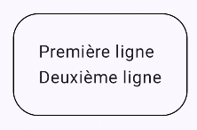
Il est possible de modifier l'apparence du Card à l'aide de ses propriétés, par exemple sa couleur, le rayon de ses coins et sa bordure.
Card (
    colors = CardDefaults.cardColors(
        containerColor = MaterialTheme.colorScheme.background,
    ),
    shape = RoundedCornerShape(25),
    border = BorderStroke(1.dp, Color.Black)
) {
    Column(
        modifier = Modifier.padding(24.dp)
    ) {
        Text("Première ligne")
        Text("Deuxième ligne")
    }
}
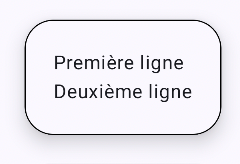
On peut aussi ajouter de l'élévation pour modifier légèrement le visuel.
Card (
    colors = CardDefaults.cardColors(
        containerColor = MaterialTheme.colorScheme.background,
    ),
    shape = RoundedCornerShape(25),
    border = BorderStroke(1.dp, Color.Black),
    elevation = CardDefaults.cardElevation(10.dp)
) {
    Column(
        modifier = Modifier.padding(24.dp)
    ) {
        Text("Première ligne")
        Text("Deuxième ligne")
    }
}
Il existe également le composable ElevatedCard qui contient une élévation par défaut.
Cette fois, pas possible de lui ajouter de bordure.
Vous remarquerez également que la couleur par défaut n'est pas la même qu'avec Card.
ElevatedCard  {
    Column(
        modifier = Modifier.padding(24.dp)
    ) {
        Text("Première ligne")
        Text("Deuxième ligne")
    }
}

Je vous présente ici quelques exemples intéressants de configurations avec Card ou ElevatedCard.
Card(
    shape = CutCornerShape(topStart = 16.dp, bottomEnd = 8.dp) ,
) {
    Column(
        modifier = Modifier.padding(24.dp)
    ) {
        Text("Première ligne")
        Text("Deuxième ligne")
    }
}

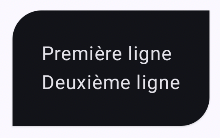
ElevatedCard(
    shape = RoundedCornerShape(
        topStart = 24.dp,
        topEnd = 0.dp,
        bottomStart = 0.dp,
        bottomEnd = 24.dp
    ),
    colors = CardDefaults.cardColors(
        containerColor = MaterialTheme.colorScheme.inverseSurface
    ),
) {
    Column(
        modifier = Modifier.padding(24.dp)
    ) {
        Text("Première ligne")
        Text("Deuxième ligne")
    }
}
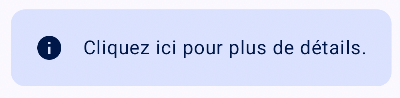
Card(
    onClick = { faireQuelqueChose() } ,
    colors = CardDefaults.cardColors(
        containerColor = MaterialTheme.colorScheme.primaryContainer
    )
) {
    Row(
        modifier = Modifier.padding(20.dp),
        verticalAlignment = Alignment.CenterVertically
    ) {
        Icon(Icons.Default.Info, contentDescription = "info")
        Spacer(Modifier.width(16.dp))
        Text("Cliquez ici pour plus de détails.")
    }
}
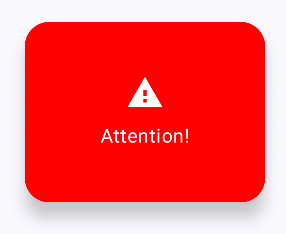
ElevatedCard(
    shape = RoundedCornerShape(20.dp),
    elevation = CardDefaults.elevatedCardElevation(defaultElevation = 8.dp),
    colors = CardDefaults.elevatedCardColors(
        containerColor = Color.Red
    ),
    modifier = Modifier.size(width = 200.dp, height = 150.dp)
) {
    Column(
        modifier = Modifier
            .fillMaxSize()
            .padding(16.dp),
        horizontalAlignment = Alignment.CenterHorizontally,
        verticalArrangement = Arrangement.Center
    ) {
        Icon(
            Icons.Default.Warning,
            contentDescription = "Alerte",
            tint = Color.White,
            modifier = Modifier.size(32.dp)
        )
        Spacer(Modifier.height(8.dp))
        Text(
            text = "Attention!",
            color = Color.White
        )
    }
}
ElevatedCard(
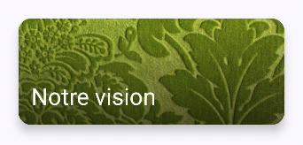
    elevation = CardDefaults.elevatedCardElevation(5.dp),
    modifier = Modifier.size(250.dp, 100.dp)
) {
    Box(
        modifier = Modifier.fillMaxSize()
    ) {
        Image(
            painter = painterResource(R.drawable.versailles),
            contentDescription = "fond",
            contentScale = ContentScale.Crop,
        )
        Box(
            modifier = Modifier
                 .fillMaxSize()
                 .background(
                      Brush.verticalGradient(
                          colors = listOf(Color.Transparent, Color.Black.copy(alpha = 0.6f)),
                      )
                 )
         )
         Text(
            "Notre vision",
            color = Color.White,
            style = MaterialTheme.typography.titleLarge,
            modifier = Modifier.align(Alignment.BottomStart).padding(12.dp)
         )
    }
}
Pour plus d'information
* « Card » - Android Developers
- Exercice 10